Release notes
Improved input fields, buttons styles, and hover states

Abi Tyas Tunggal November 25, 2020
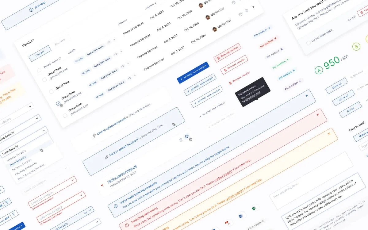
We’ve updated input fields and buttons styles throughout the platform to ensure consistency. Whether you’re searching for findings on your risk profile, looking for a specific vendor, or filtering vulnerabilities, input fields and buttons should now look, feel, and behave in the same way. This makes it easier for new users to get up to speed quickly and for existing users to learn how to use new features as we release them.
In addition to these changes, we’ve made accessibility improvements to our icons by increasing their clickable area and adding hover states. These improvements mean the platform is easier to use for users with smaller screens or poor eyesight.